Friday 15 April 2011
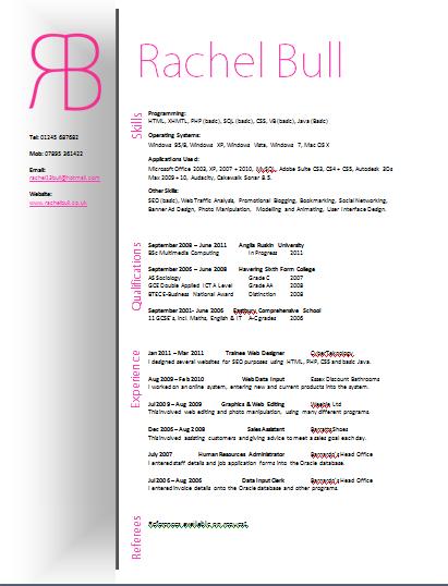
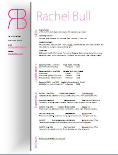
CV
This is my CV which I created for my portfolio and personal branding. I included the logo and included the colours grey and pink because they represent calm and sophistication. I kep the CV as minimal as possible because it looks professional
Saturday 26 March 2011
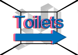
Exhibition Signs
This is the sign I have made to go around the exhibition. There are also other signs saying "This Way", "Entrance" etc.

Wednesday 9 March 2011
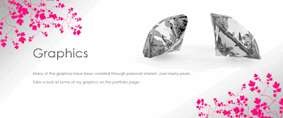
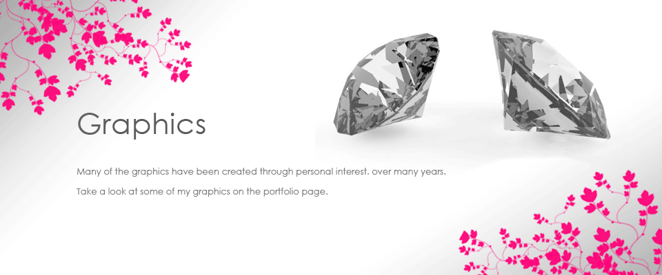
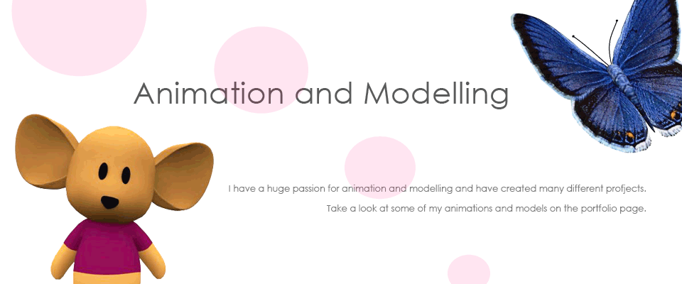
Banners for the website
Here are the banners I created to go on the website to act as links and homepage banners. I like how these came out and they add to the effect of a creative website

Sunday 6 March 2011
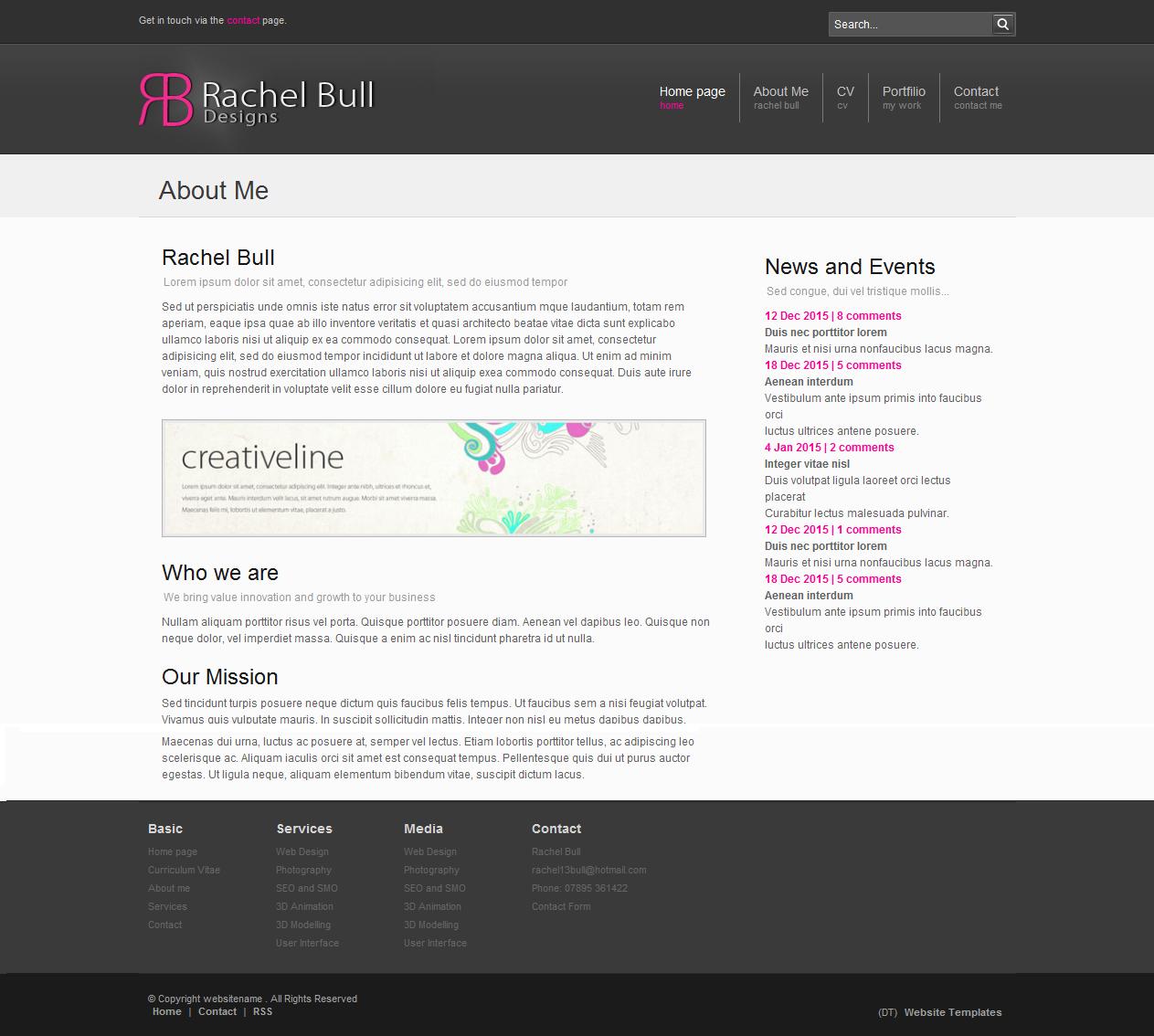
Personal Branding - Website
This is the website I created to show my work and act as an online portfolio. I made sure the website was easily accessable and have registered with with google as that I can be searched and people will be able to look at my work.

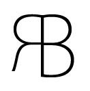
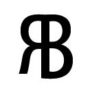
Personal Branding - Logo
These are some of the logo designs I created, they are all the same design but with different fonts. The one I chose is the pink one because it has the best font and it represents me well. It is a butterfly and also my initals.


Tuesday 1 March 2011
Personal Branding - Business Card
This is my business card that I created to match the logo design, CV and website. I think this is a very professional business card it lets potential employers know what skills I have, so it sort of acts like a mini cv as well.


Saturday 26 February 2011
Psychology of Colours
While looking into personal branding, I wanted to study the psychology of colours to see which tons and colours would be best to use in my designs. By choosing the colours carefully, I will be able to subtly influence the viewers subconscious.
The colour BLUE is well known as a trustable, dependable and committed colour. This is because it represents things which are constant in our lives such as the sky and the ocean. However, some shades of blue, particularly the overuse of blue can be seen as cold and uncaring.
The colour YELLOW is conveyed as optimistic, enlightening and happy. Some shades of golden yellow convey and promise of a positive future. This colour will instill optimism and energy, as well as a encouraging creative thoughts.
The colour GREEN acts as the ideal backdrop in any design as we are used to seeing it everywhere. Natural greens are seen as tranquil and refreshing. However, green can also be associated with illness and government, which give off negative emotions.
The colour ORANGE is perceived as a "love it" or "hate it" colour. Certain shades of orange can generate a sense of warmth and energy.
The colour PURPLE has very mystic and royal qualities. It is often liked by creative or eccentric people. Purple conveys a sense of wisdom, wealth and spirituality. This colour often represents adolescent girls.
The colour BLACK is seen as authoritative and powerful because black can evoke strong emotions. Can make an item or design look more sophisticated. This colour can bring on a sense of potential and possibility.
The colour WHITE is perceived as pure, clean and neutral. This colour aids happiness and security. It also evoke clear thoughts and mental clarity.
The colour BROWN can reflect stability and reliability. It is the colour of our earth so it is associated with all things natural and organic. It gives a person the feeling of wholeness.
The colour GREY can be associated with loss or depression. However, it is mainly timeless, practical and solid.
The colour PINK essentially associated with light red and is seen as the colour of love and romance. It can have a calming effect on a person. It can make a person passive and less energetic.
Subscribe to:
Posts (Atom)